What is a Screenshot ?
A screenshot is a static visual metadata element that is part of every product page. Without at least one screenshot, apps can neither go live on iOS nor Android.
Screenshots have no impact on an app’s visibility in search results. But they can help to convince users of downloading the app, so they are important for conversion rate optimization. This is especially true on iOS, because up to three screenshots appear directly on SERPs.
Screenshots on iOS
On iOS, screenshots are device-specific. App owners can submit up to 11 sets for different device types and screen sizes. Three of them are mandatory.
| Device Type | Device Size | Screenshot Size (in pixels) | Required? |
|---|---|---|---|
| iPhone Xs Max | 6.5 inch | 1242 x 2688 2688 x 1242 | yes |
| iPhone X / Xs | 5.8 inch | 1125 x 2436 2436 x 1125 | no |
| iPhone 8 Plus / 7 Plus / 6 Plus | 5.5 inch | 1242 x 2208 2208 x 1242 | yes |
| iPhone 8 / 7 / 6 | 4.7 inch | 750 x 1334 1334 x 750 | no |
| iPhone SE | 4 inch | 640 x 1136 1136 x 640 | no |
| iPhone 4s | 3.5 inch | 640 x 960 960 x 640 | no |
| iPad Pro 3rd Gen | 12.9 inch | 2048 x 2732 2732 x 2048 | yes |
| iPad Pro 2nd Gen | 12.9 inch | 2048 x 2732 2732 x 2048 | yes |
| iPad Pro | 11 inch | 1668 x 2388 2388 x 1668 | no |
| iPad Pro, iPad Air | 10.5 inch | 1668 x 2224 2224 x 1668 | no |
| iPad, iPad mini | 9.7 inch | 1536 x 2048 2048 x 1536 | no |
Screenshots on Android
On Android, app owners need to provide only two sets: One for phones and one for tablets. Per set, they can upload up to eight different creatives.
The requirements are simple: All creatives must measure between 320 and 3840 pixels in height and width.
Content in Screenshots
The original idea behind screenshots was to present users a non-manipulated demo of an app. This WYSIWYG (what you see is what you get) approach is still valid, and many app owners follow it by uploaded “raw” unedited in-app footage.
But other marketers developed numerous techniques to improve viewers’ experience.
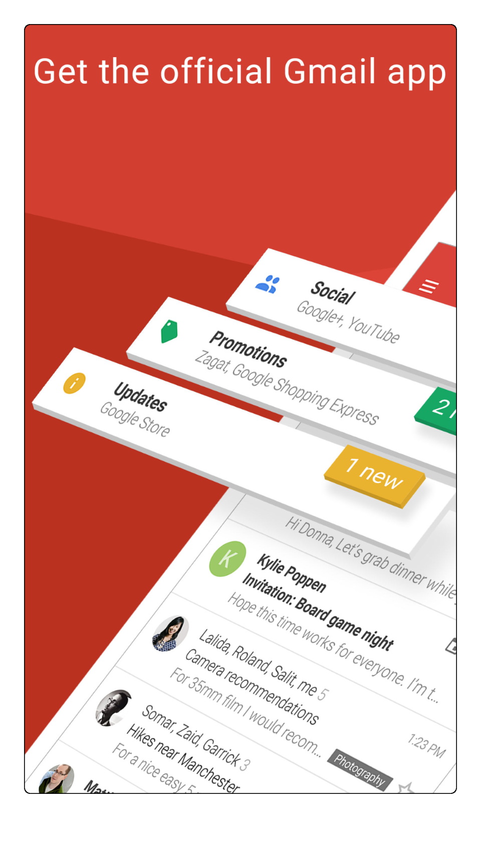
Adding device frames is the most common approach for this purpose. It makes screenshots more appealing and also creates space around the in-app footage. This space can be used for additional elements such as captions that explain the visual content in more detail (example: Pacifica).

With more advanced techniques, it is possible to guide users’ eyes to elements that are crucial for understanding the screenshot’s content. These include:
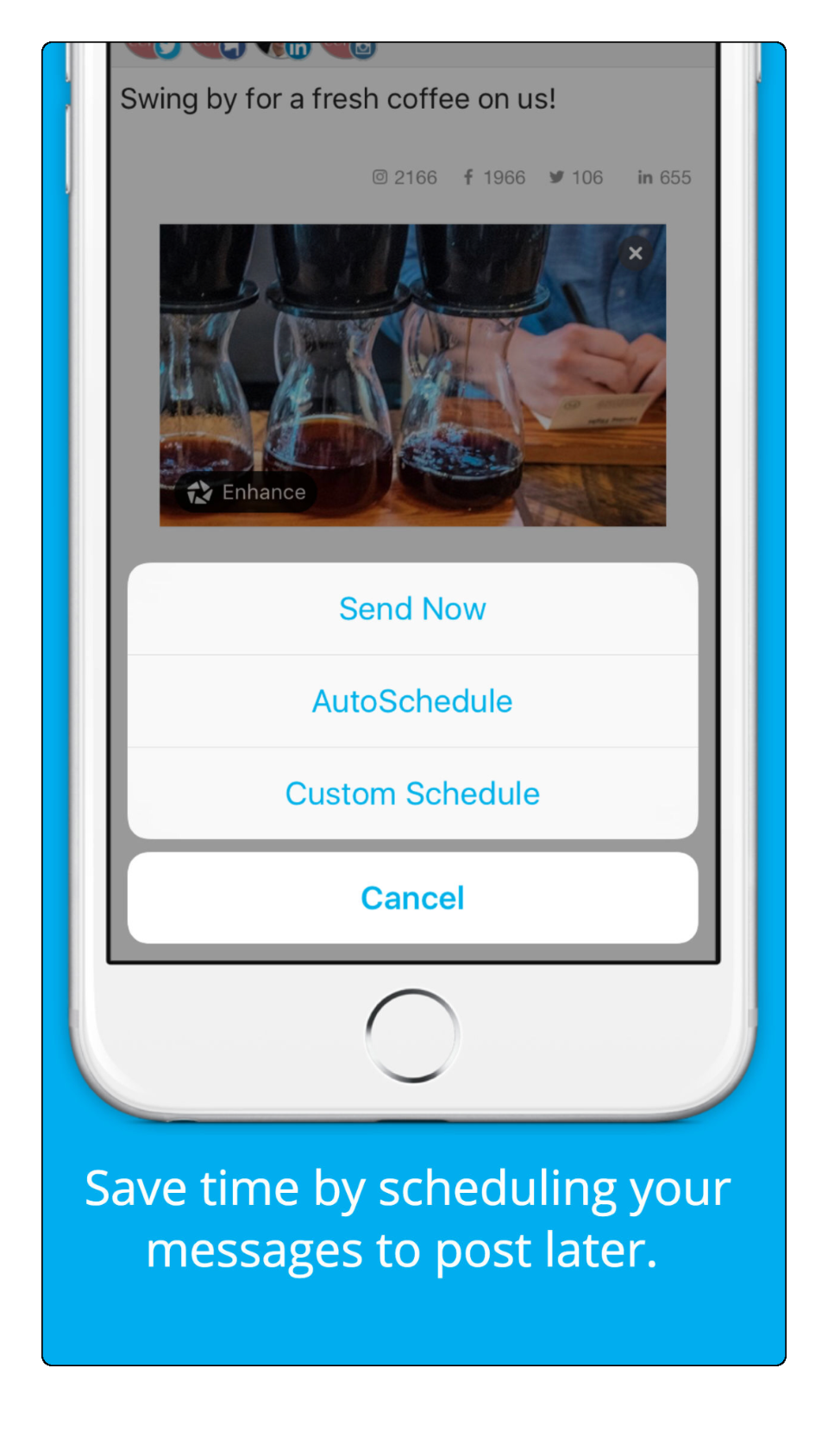
- The use of partial devices that emphasize a specific area of the in-app footage (example: Hootsuite)


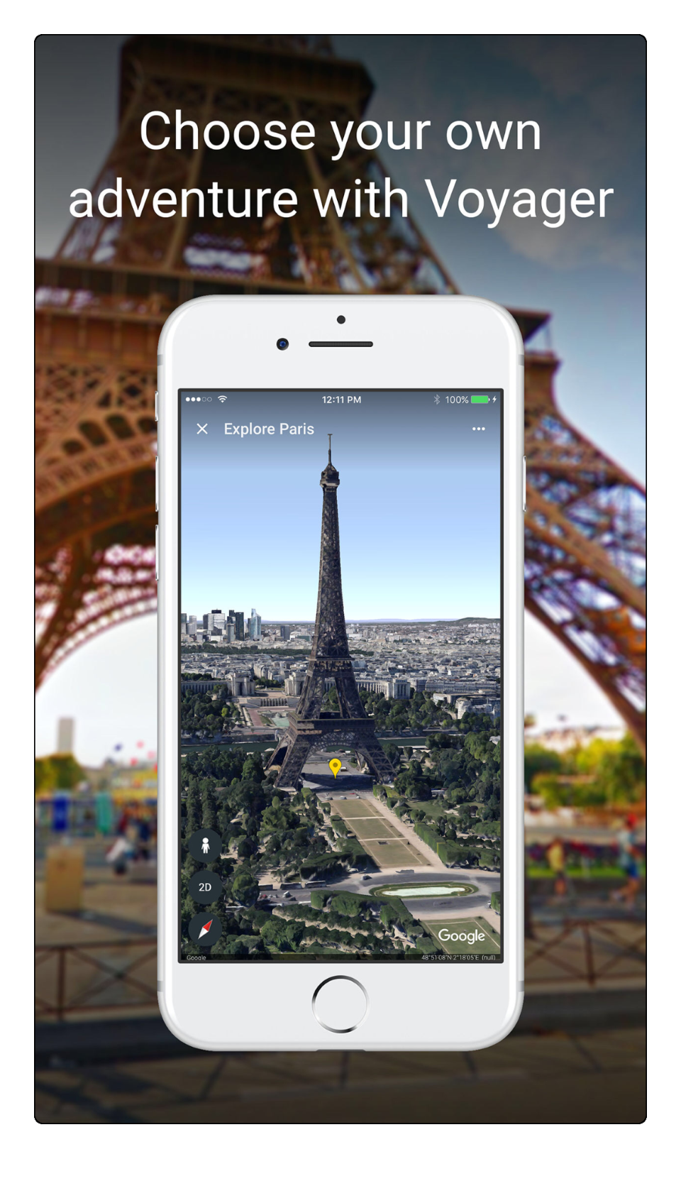
Another common approach is the use of background pictures to beautify screenshots. Besides, relevant artwork gives users the feeling that the app is relevant to them and can solve their problems or fulfill their needs (example: Google Earth).

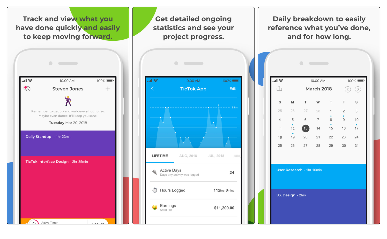
Foreground elements (in-app footage and device frames), as well as background art, can be connected across screenshots. This connected style makes the entire set more appealing (example: TicTok).

Branding
Screenshots are also a great tool to create branding effects. Especially the first shots that appear in SERPs have a high potential to build brand awareness across viewers. The easiest way is to integrate the brand logo.
Promotion
To announce special offers, new features, or other interesting news connected to the app, designers can use promotional shots. These do not contain any in-app footage. Instead, they focus on a marketing message.