One of the biggest challenges for app owners is to make users return to their app. Only 43% of users still use an app one month after they downloaded it. And 25% use an app only once and do not return for a second session. To avoid this kind of churn and increase short term retention is essential to every app business because retention is the basis for creating long-lasting (and profitable) relationships with users. One way to reach this goal is to provide a great onboarding process.
Learn the App Retention Basics: WHAT IS APP RETENTION AND WHY SHOULD YOU CARE ABOUT IT?
WHAT IS MOBILE APP ONBOARDING?
App onboarding is the process of making new users familiar with an app and its features when they open it for the first time. Its purpose is to explain to people how to use the app properly and how to enjoy its benefits to the fullest.
WHY IS APP ONBOARDING IMPORTANT?
There is no second chance for a first impression. Like in many other areas of life, this slogan applies to apps as well. Users who do not understand how an app works immediately are likely to abandon it soon.
App onboarding helps these users to find the information or features they need. It functions as a technical manual as well as a motivational coach and encourages people to interact with the app. By doing so, app onboarding decreases the risk of frustration and boredom, and increase the likelihood that users come back to use the app again.
Proper onboarding will result in higher retention rates and thus contributes to:
- Positive impacts on App Store Optimization because both Apple’s and Google’s algorithms reward high retention rates with better keyword rankings on SERPs.
- More active users and a more lively community.
- More potential customers and thus higher revenues expectations from in-app purchases.
- Higher earnings from ads.
- Less support requests because of bad user experiences.
WHICH APPS NEED ONBOARDING?
Not every app needs an onboarding process. If the purpose of your app is clear, and its features are well-known to the audience, the need for onboarding might not be given. But in many cases, it makes perfect sense to implement a proper process to make people familiar with your app:
- Apps that offer disruptive services, use new technologies or are by any measure completely different from all competitors.
- Apps that might overwhelm users because of the variety of features or content they contain.
- Apps that are dependent on user-generated content and thus look rather empty when opened for the first time.
- All apps that have a low short term retention rate.
- Apps that get a significant redesign or essential new features after an update.
WHAT TYPES OF APP ONBOARDING EXIST?
Although there is no such thing as a standard onboarding or a best practice that matches all kinds of apps, you can see three general trends in the app industry. All of them are helpful for specific apps.
Static App Tours
Static cards that give users a short tour of the most important features of the app are a very common way of onboarding. They present a little text and in many cases simple graphics. Usually, between three and five cards compose this static onboarding process that happens when the user launches the app for the first time. It is a good approach for apps that are more or less self-explanatory.
Interactive Onboardings
For educational apps, it makes sense to gather information from users to learn about their knowledge level. Based on these details, the app can deliver more relevant content and improve users’ experiences. The best way to get this information is an interactive tutorial like a questionnaire or a quiz. Similar onboarding processes are used in many apps in the fitness, meditation, or dating sectors.
Contextual Guides
Especially for feature-rich apps, onboarding might get an extensive process when done “en-bloc”. For these apps, it makes more sense to give users little portions of helpful information whenever they access a page in the app or use a feature for the first time. Contextual onboarding can be interactive too.
16 BEST PRACTICES FOR APP ONBOARDING
So which of the different types of onboarding types is right for your app? The answer strongly depends on the variety of features or content and the complexity of your app. The more complex it is, the less effective a static process will be. And the more content you offer, the bigger is the need to tailor individual experiences for users based on the information gathered during an interactive onboarding.
For most apps, a mix of the three types is the best solution. But in any case, you should follow these best practices for app onboarding:
1 – Emphasize Your App’s USPs
Tell users about your most important or most special features. Let them know how your app improves their lives.
Take user feedback into account: If app store reviews or support requests indicate that users love one particular feature (or are confused about one), prioritize to explain it in detail during the onboarding.
Check out how Todoist does it: On three cards, they mention the app’s features and the outcome of using them.
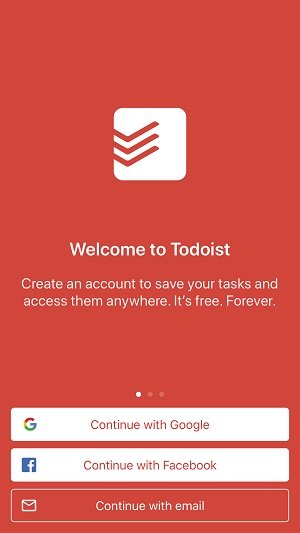
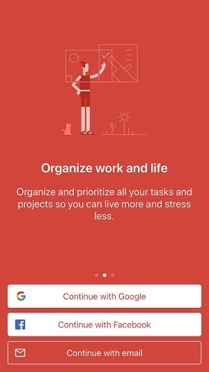
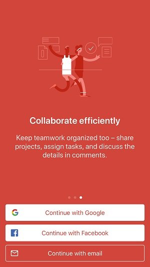
Static App Onboarding of ToDoist
2 – Keep the Onboarding Process Short
The longer your onboarding process is the less likely is it that users get frustrated and leave. A survey by Clutch shows that an onboarding process that takes longer than 30 seconds will frustrate 21% of users. If it takes 1 minute or more, the percentage of annoyed users increases to 28%.
So keep your onboarding rather short to avoid putting users off, especially when using a static process.
3 – Present Tips One by One
Feed users helpful information in small bites. For every instance of your onboarding process, explain only one function. Do not show multiple tips at once to avoid confusing people.
4 – Give Users the Option to Skip
Even if the process is short, it might not provide value for everyone. For instance, if users already know your app, they do not need to walk through a tutorial again. Forcing them to complete it nevertheless might be frustrating. Thus, you should always provide the option to skip all steps of the onboarding process or tutorial that are not mandatory (the registration process might be an exception).
5 – Lay the Foundation for Long-Term Retention
If you have implemented tools to increase retention in the mid and long term, explain them during the onboarding process. For instance, if you provide daily login rewards, introduce this feature and give users a preview of the rewards they can earn when using your app regularly.
6 – Make the Onboarding Interactive
Learning by doing is much more effective than learning by reading. So encourage your users to perform actions instead of only reading about them. This is especially important for games.
7 – Personalize the User Experience
Personalize your onboarding process. Call users by their names (after you have asked for it). But more important, personalize their experience. Ask for their goals or interests, so you can later provide them with the most relevant content.
When launching 30 Day Fitness for the first time, users are asked for their fitness experience and their goals.
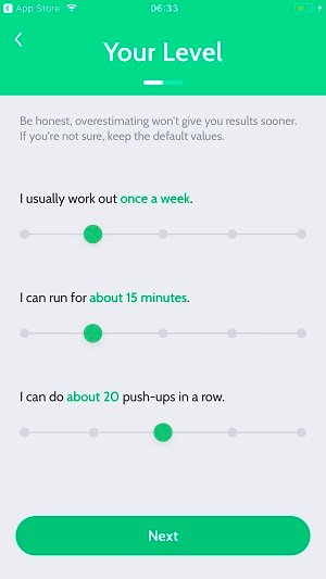
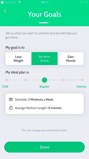
Interactive Onboarding of 30 Day Fitness
8 – Indicate the Progress of the Onboarding Process
For interactive processes that contain multiple steps, let users know how many are left at any point in their journey. If people know that they are close to the end of the process, they are more likely to actually complete it than when it is unclear how many steps are left.
Dots at the bottom of the page or a vertical bar that fills up while users proceed are two ways to indicate progress. But you can also use checklists to let users know which tasks they already have finished and how many are left.
The screenshots below show the onboarding process of Duolingo, an app for learning languages. While users answer questions aiming at their learning goals, a green bar indicates the progress of the quiz.
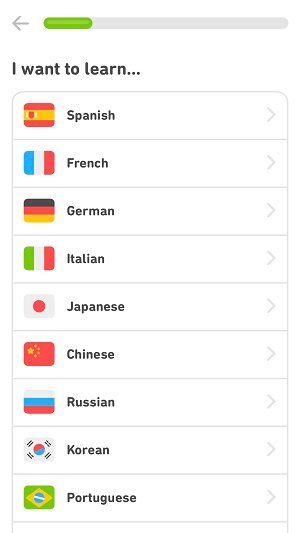
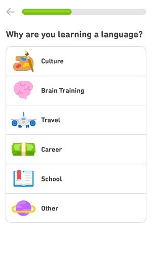
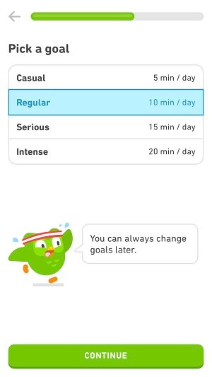
Interactive Onboarding of Duolingo
9 – Provide Contextual Help
Stay away from showing users dozens of guides that are not relevant yet. Most likely, they will not memorize all of them. Better show them contextual tips when they are really helpful. For instance, explain a feature to them when they are actually about to use it for the first time.
10 – Give Visual Guidance
When explaining features, make sure that users focus their attention to the right places by guiding their eyes. Use colors, markers, and visual effects for this purpose.
The interactive tutorial of the match-3 game Homescapes visualizes the basic moves to master the game at the beginning of the first level. During the quick tutorials, the rest of the screen is grayed, so users must focus on the explanation. Whenever new game elements are introduced, a similar mini-tutorial appears.

Contextual Onboarding of Homescapes
11 – Make the Onboarding Beautiful
If your onboarding is boring, it might put people off instead of bounding them to your app. Thus, put some effort into it. Make it cute, playful, or beautiful, so it transports the emotions you want your users to feel.
Check the example of Travello, a travel diary app. When starting the app, users see a background video with beautiful travel destinations that address all kinds of travelers from backpackers to fans of winter sports.
Onboarding of Travello
12 – Create Brand Awareness
Make sure users keep your brand in mind, so when they talk about their new app with friends and family, they can call it by its name. So show your app name, your logo, and your mascot during the onboarding process.
13 – Respect Data Privacy
People get more and more conscious about their data privacy these days. Thus, you should respect their concerns. Do not collect more data than you really need to provide them the best experience. Explain why providing the information you ask for will benefit users.
Also, let them know why your app needs the permissions it asks for. The meditation app Meditopia wants to send users notifications. To encourage them to accept this request, they emphasize their positive impact.
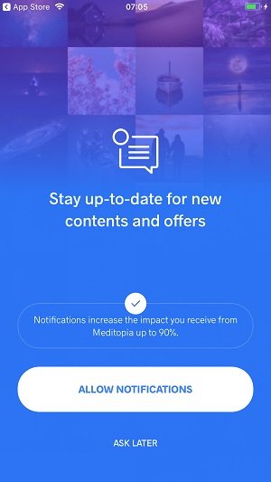
Onboarding of Meditopia
14 – Do not Force Users to Register
If you ask users to register right after they launch the app for the first time, this might put some of them off. Remove this barrier and let them experience your app without the need of putting in their personal data. Users that enjoy their experience are much more likely to commit to your app and create an account.
When starting Journi, another travel diary app, for the first time, users can signup with their email address or their Facebook account. But they also have the option to skip and register later.
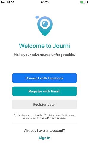
Onboarding of Journi
15 – Offer Social Login
However, If users must sign in to use your app, make the registration process as easy as possible. Giving them the option to use their Facebook or Google account or another form of social login will save them time and make the sign up much easier.
16 – Measure and Optimize
When setting up your onboarding process, make sure that you can measure user behavior. Track how the single steps of the process affect user behavior and optimize them on a regular basis.
APP ONBOARDING EXAMPLES
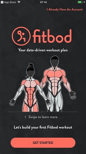
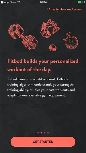
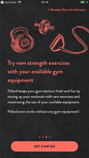
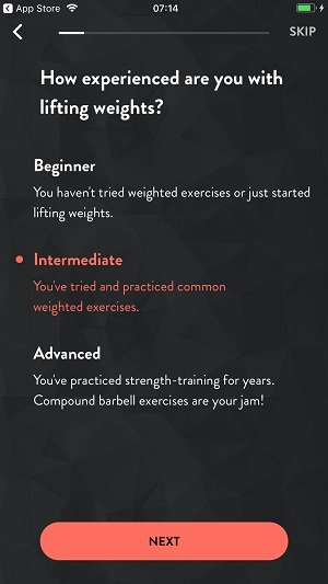
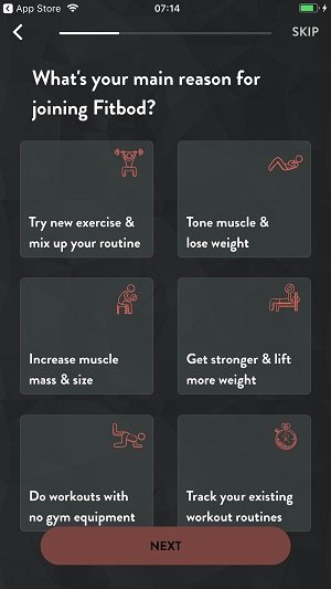
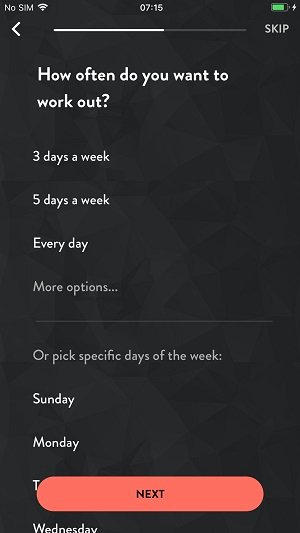
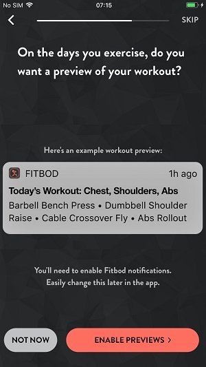
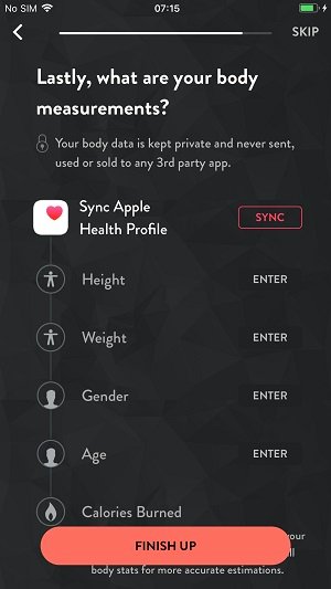
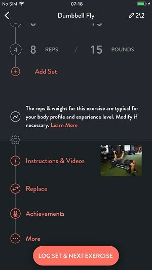
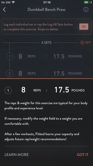
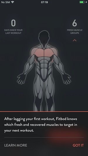
Finally, let us have a look at the great onboarding process of the fitness app Fitbod. It combines all three types of onboarding to create a very helpful user experience. Check out the slideshow below.
CONCLUSION
With a proper onboarding process, you can avoid user churn, gather information to create individual experiences, and create the basis for long-term relationships with your users. Optimizing the onboarding should be an ongoing process. And whenever you add new features or make major redesigns to your app, you should review and adjust the onboarding procedure as well.
Onboarding is just one of many measures to increase user retention. Make sure to take care of the others as well.
Learn more: 12 METHODS TO INCREASE MOBILE APP USER RETENTION
By the way: The onboarding process is also a good tool to increase revenues from in-app purchases.
Learn more: HOW TO INCREASE IN-APP PURCHASES AND BOOST APP REVENUES
