Screenshots are the biggest visual metadata elements in the app stores. They attract users’ attention and give them an impression of how an app looks like. While some app owners choose to present unmodified pictures of their app, others have developed sophisticated techniques to improve the viewer’s experience and increase their conversion rates. By adopting the right techniques for your screenshot set, you can generate more app users as well.
HERE ARE 10 TIPS FOR APP STORE SCREENSHOT DESIGN:
- Create a Visual Tutorial
- Pull the User’s Attention to the Right Spot
- Use Captions
- Take Care about Readability
- Beautify the Screenshot Background
- Add Branding Assets
- Use Your Screenshots to Tell a Story
- Diversify Your Screenshot Set
- Create Cross-Screenshot Designs
- Add Promotional Creatives
TIP 1: CREATE A VISUAL TUTORIAL
Showing users your in-app footage is a proper way to demonstrate your app’s look. But it might lack explanatory information. If viewers do not understand what they see, a screenshot will rather confuse them and as a result harm conversion rates than encourage them to test your app.
With small adjustments, you can provide a tutorial that helps people understand your screenshot’s content:
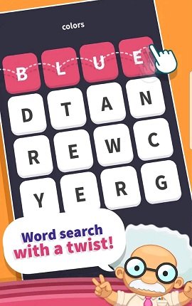
By adding photographed or animated fingers or hands, you can demonstrate tapping or swiping actions and show users how to use the presented feature. The makers of WordWhizzle did so to explain how to play their game.
Show how your app works in real life like the screenshot that demonstrates how the Google Translate app helps users translate street signs.
Show people enjoying your app like the girl in the screenshot below of enjoys playing Heads Up.

TIP 2: PULL THE VIEWER’S ATTENTION TO THE RIGHT SPOT
Some screenshots contain so much content that they overwhelm viewers and prevent them from recognizing relevant details. To avoid confusing people like that, pull their attention to the right spots. You can do so with different measures:
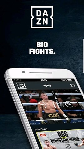
Show partial screenshots instead of complete devices. By cutting your raw assets in half, you can not only reduce the risk of distraction from the important details, but you can also enlarge the relevant parts so viewers can identify them easier. Have a look at the screenshot of DAZN. To show their live streaming feature, they focus on the upper half of the raw screenshot where the stream is running and cut off the rest of it.
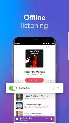
Use augmentation. Augmentation is a sophisticated technique that adds new foreground layers to your screenshots by enlarging or popping off single elements and push it into the viewer’s focus. In the screenshot below, you can see how the designers of the streaming app Deezer emphasized their feature for hearing music offline: They popped off the download button and enlarged it so it catches the viewer’s attention immediately.
TIP 3: USE CAPTIONS TO EXPLAIN YOUR SCREENSHOTS
Text elements are a very easy way to add useful information to screenshots. And they do not only help explain content, but they also are valuable in terms of relevance. If users search on the app store for a specific keyword and then see this term in a screenshot, they will be much more likely to download the app. Thus, you should include the results from your keyword research into your screenshot captions.
Learn more: HOW TO DO APP STORE KEYWORD RESEARCH FOR IOS AND ANDROID
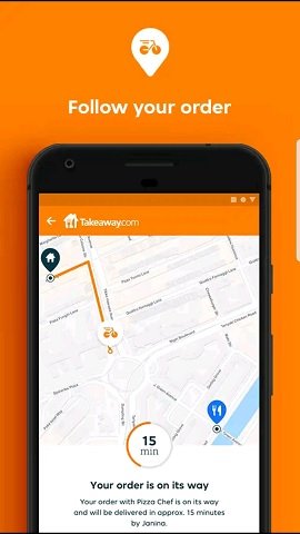
In some cases, it makes sense to use small icons to add some extra guidance and make them more varied. See how Takeaway.com did it in their screenshot set.
TIP 4: TAKE CARE ABOUT READABILITY
Whenever you add elements to your screenshot, you must make sure that it does not harm the readability. For text elements, this is in particular crucial. If your fonts are too small, or if their contrast is bad, users will have a hard time reading them.
To avoid this problem, follow these guidelines:
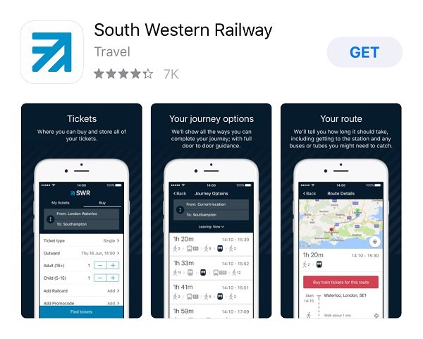
Limit your captions to four or five words per screenshot. To make longer texts fit into your screenshot, you will most likely have to decrease the font size. This will harm the readability, especially when iOS users see your screenshots on SERPs. Check the example of South Western Railway below. Their screenshots contain way too much text that is barely readable.
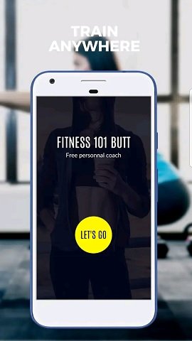
Avoid using similar colors for your captions and background art. The white captions in the screenshot of Fitness 101 are barely readable because the background photo is very light as well.
By using outlines or a new background layer for your captions, you can increase their readability significantly. Check the screenshot of Ab Workout Trainer HD for an example of outlined captions.

TIP 5: BEAUTIFY THE SCREENSHOT BACKGROUND
Showing your screenshots on a unicolor background is a decent way to present your content. But it is also a little bit boring. To make your screenshots more interesting and beautiful, consider using background art.
A simple design pattern of different colors is better than a unicolor background. But you can also use a photo instead. Photos do not only look more interesting, but they can also add relevance to your screenshot, given it matches the presented feature or the purpose of your app in general.
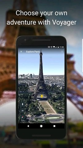
Look at the screenshot from Google Earth. It shows the Eiffel Tower on the device screen but also on the background photo. To ensure that the background does not distract the user too much, you can blur the photo.
TIP 6: ADD BRANDING ASSETS
Besides a tool to convince users of downloading your app, app store screenshots can also be an asset to increase people’s awareness of your brand. So even if they do not download your app right away, people who are aware of your app and its qualities might remember it and use it at a later point.
To create a screenshot that makes users remember your app, you have several options:
Use the same colors or color schemes for your screenshot backgrounds or captions that you have used for your app icon, so you create a congruent experience that sticks to the mind.
Learn more: THE 5 GOLDEN RULES FOR APP ICON DESIGN ON IOS AND ANDROID
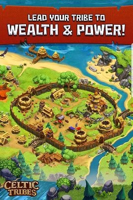
Add your app’s or company’s logo to one of its corners like the designers of the screenshots of the strategy game Celtic Tribes did it.
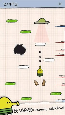
If you have a mascot or another recognizable character, show it in the screenshot. Check out the screenshots of Doodle Jump. They all contain the game’s main character, called “The Doodler”.
Even better than an animated character is a real human who gives a testimonial about your app’s quality. A celebrity that people know and love is a great branding asset, so show him or her in your screenshot. For example, famous coach José Mourinho appears in most of the screenshots of the soccer manager game Top Eleven.

TIP 7: USE YOUR SCREENSHOTS TO TELL A STORY
When designing your screenshots, do not deal with them on an individual basis. Think of them as a set and draw a connection between them. When done right, you can tell a story with this set that is much more convincing of your app’s quality than a collection of stand-alone screenshots.
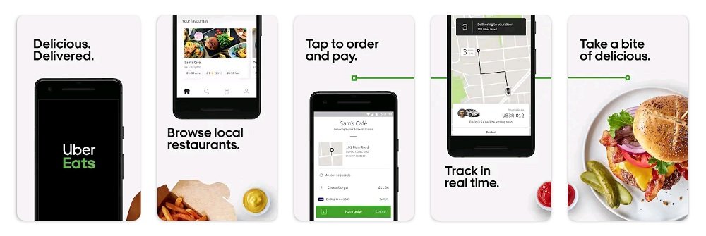
Check out how Uber Eats does it: They have created one screenshot for every step in the user journey from browsing restaurants to enjoying a meal. A similar story can be told for most apps and many games.
TIP 8: DIVERSIFY YOUR SCREENSHOT SET
To make your screenshot set more interesting to look at, do not use the same arrangement for all single creatives. For instance, instead of showing a full device with captions above it, show partial devices or devices with captions below them.
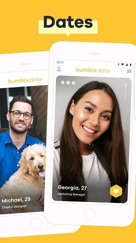
In some cases, it makes perfect sense to include multiple devices in one single screenshot. For instance, one screenshot of the dating app Bumble shows two phones that show different user profiles. This motif perfectly illustrates the purpose of the app: meet other people and go on a date.
Other reasons for using more than one device in a screenshot is emphasizing the variety of content or the cross-platform abilities of the app.
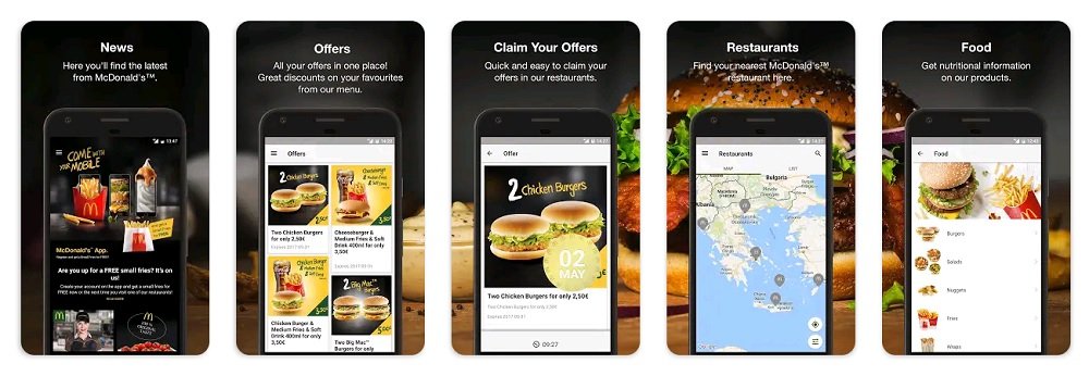
TIP 9: CREATE CROSS-CREATIVE DESIGN
A great way to make your screenshot set stand out against competitors is to create a cross-creative design. Connect backgrounds to make them look like they are one big creative.
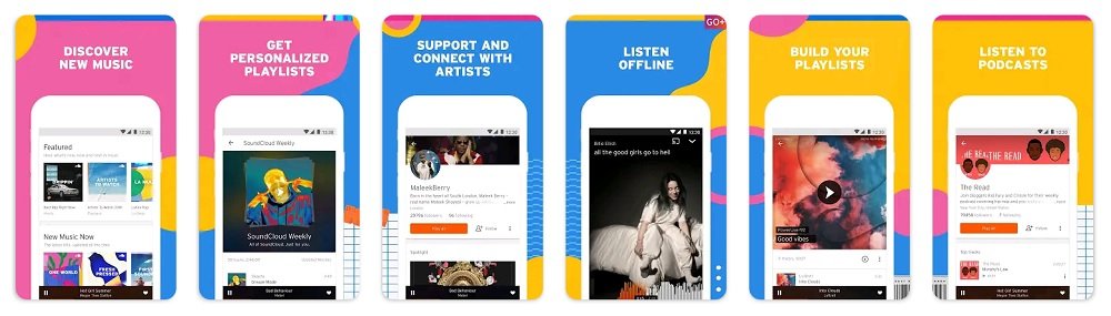
You can do so with simple graphic patterns like the product page designers of Soundcloud did.
Alternatively, you can also use a photo like McDonald’s. They show a burger meal in their screenshots to create a connected background.
TIP 10: ADD PROMOTIONAL CREATIVES
Besides introducing your app’s features and content, you can use screenshots to announce promotions. Especially on Apple’s App Store, where they appear on search results pages, screenshots are great means to communicate special offers, discounts, or other relevant messages. Below you can see an example screenshot from the app Mollie Makes that promotes a temporary offer for new users.

CONCLUSION
A screenshot set is a great tool for creating curiosity and interest in your app across your potential users. You can use them to draw attention to your product page, explain your app, and emphasize its ability to solve users’ problems.
No matter which technique you choose for your screenshot, make sure it matches your app. Colorful background arts are rather not a great match for a finance app. Also, do not overdo it. Additional design elements should improve the user experience, but they should not be the center of user attention.

DO YOU WANT TO LEARN MORE ABOUT ASO?
Then you should check out the App Store Optimization Book.
On more than 300 pages, you will learn everything you know about ASO, including keyword research and implementation, writing app descriptions, designing screenshots and app icons, composing app preview videos, and localizing your product page.
The ASO book offers easy to understand step-by-step guides and more than 140 helpful figures and example graphics.
